

A common question we have received regarding our 12 Box ITAM Maturity Assessment is:
“What does the output of the assessment look like?”
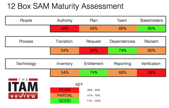
I have included a few screenshots below.
In a nutshell, as a result of completing the assessment:
- Each organization receives a heat-map which highlights scores against each area
- Each area is then broken down into the competency areas we would expect in that area – For example for the area of Authority – what does good look like? what would we expect to see in a world class ITAM practice?
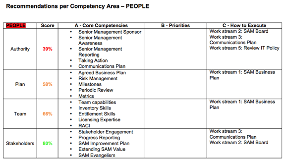
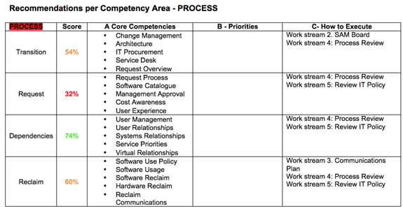
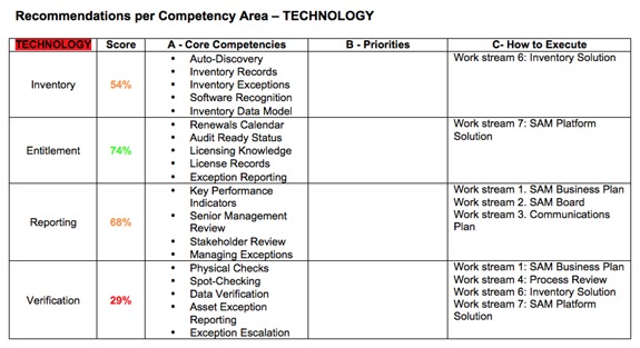
- Following this – we then provide specific recommendations and suggested work streams. This allows an organization to turn the assessment into a business plan with action.
12-Box ITAM Maturity Assessment Sample Output
If you have any further questions please give me a shout. You can also see further info on the FAQ and 12-box page.
